
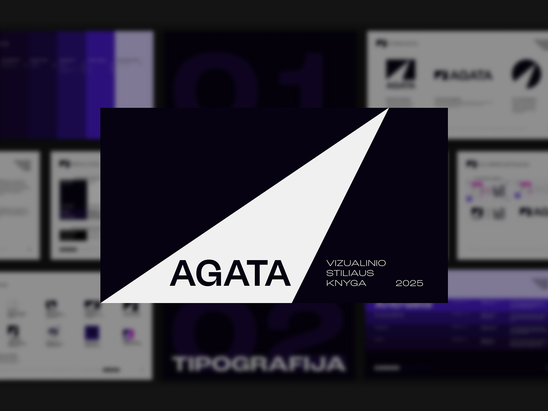
AGATA
AGATA had a visual identity. It just didn’t behave like one. The task was to take a fragmented set of elements and turn it into a coherent system – not to redesign, but to make it finally work together.
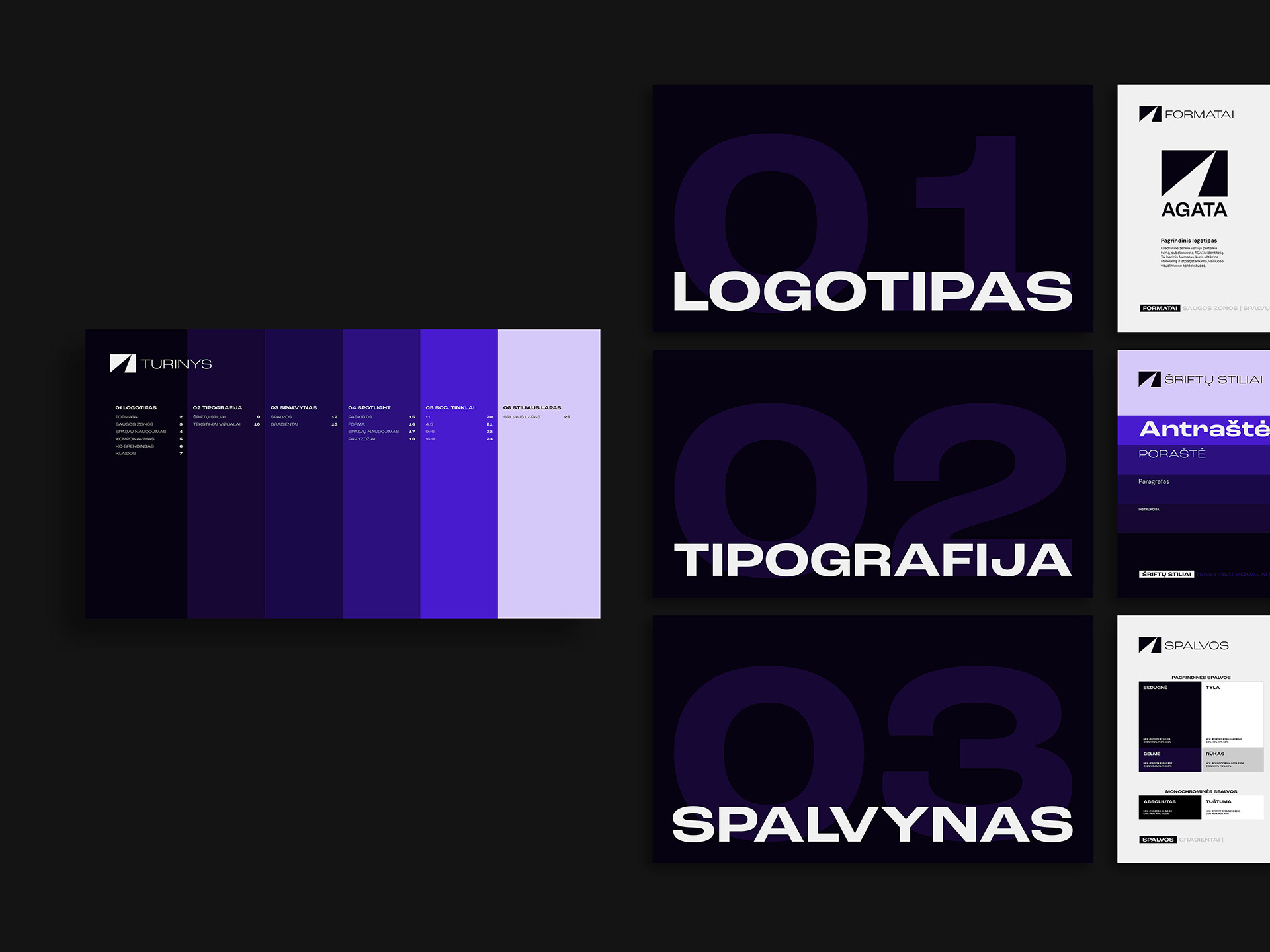
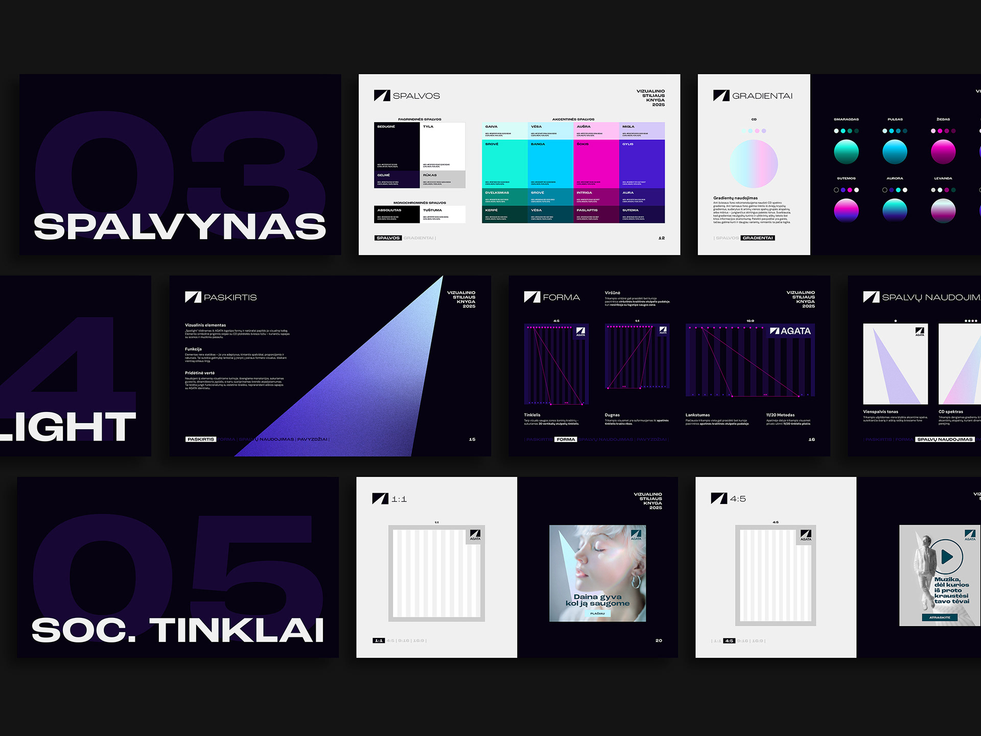
Starting from a single anchor, the logo, the entire visual language was built around it: structure, typography, colour logic, composition rules. Everything defined, aligned and documented into a clear, usable brandbook.
No guesswork. No interpretation gaps. What used to be scattered became controlled. What was inconsistent became intentional.
A brand that looked established finally started acting like one.
BRANDBOOK
˙ ˖ ✦ Thanks for wandering! ✦ ˖ ˙