
INOTORF
Inotorf is a brand operating in the field of growing media and plant-based solutions, where different products require clear differentiation while maintaining a unified identity.
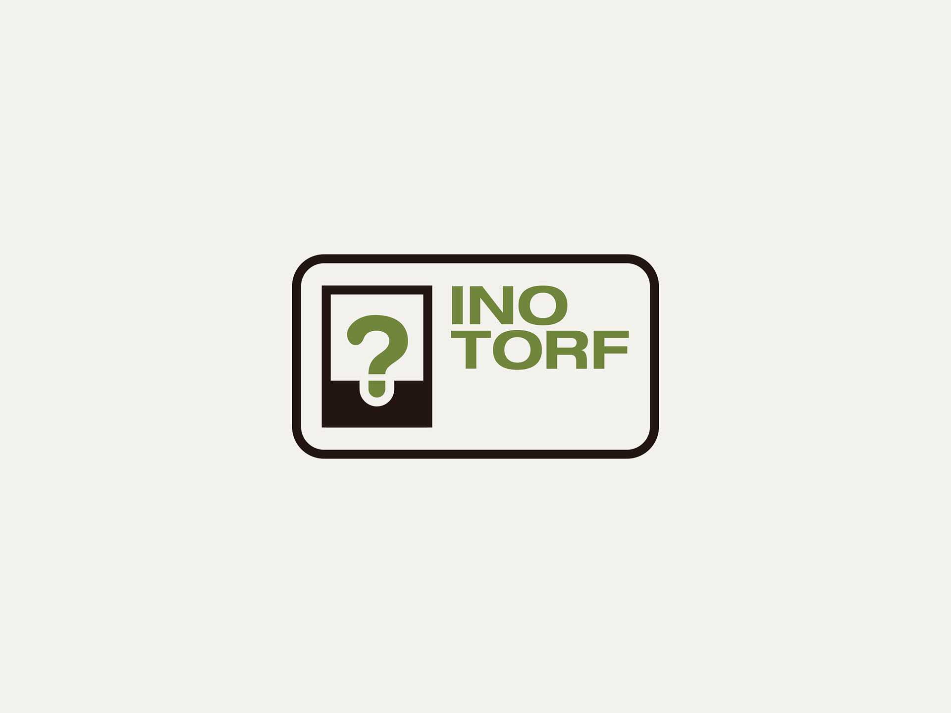
Pointy Hat studio developed a flexible logo and identity system built around an “ID card” concept. At the core of the mark, a seedling forms a question mark - a symbol of growth, exploration and adaptability.
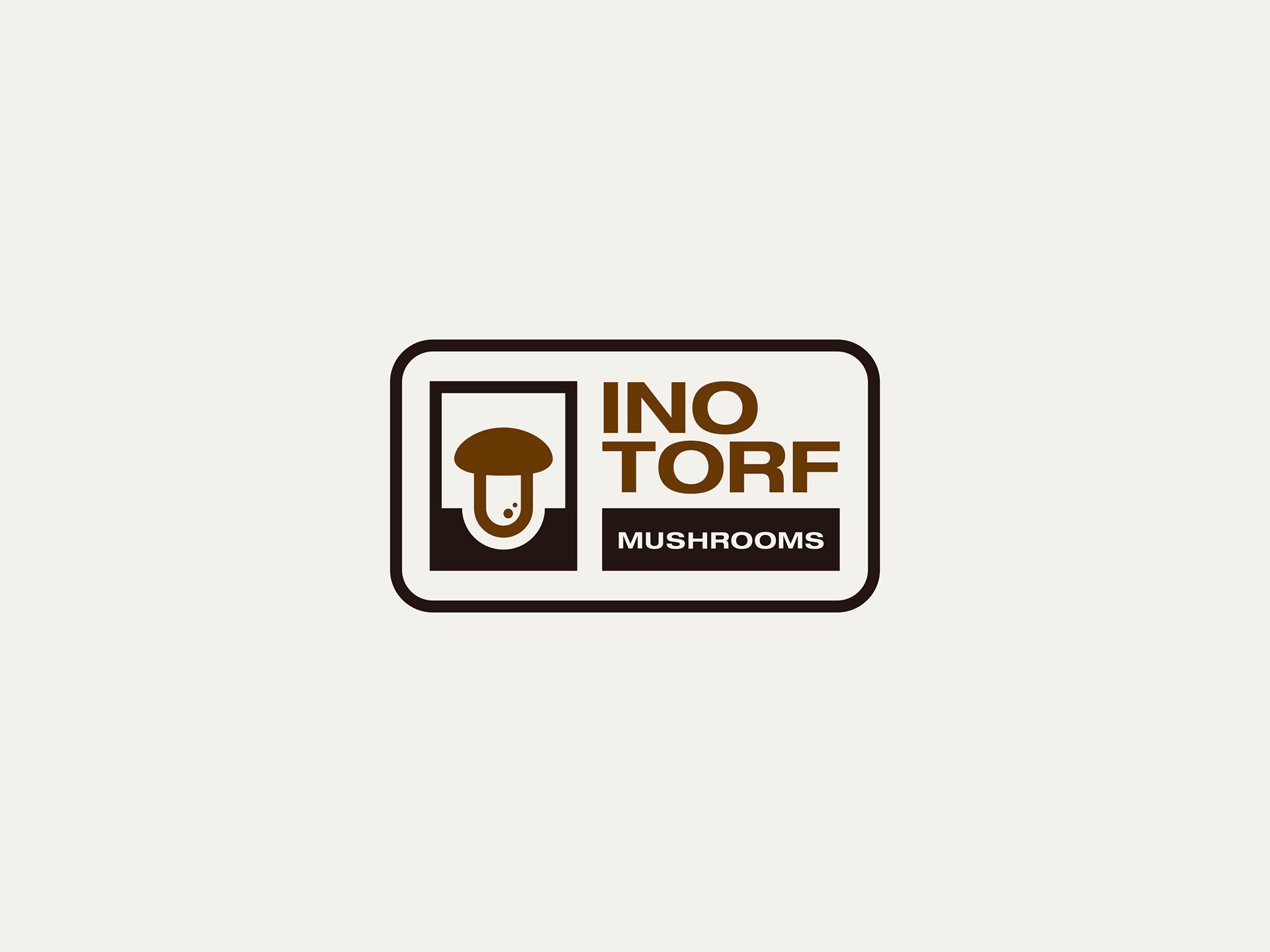
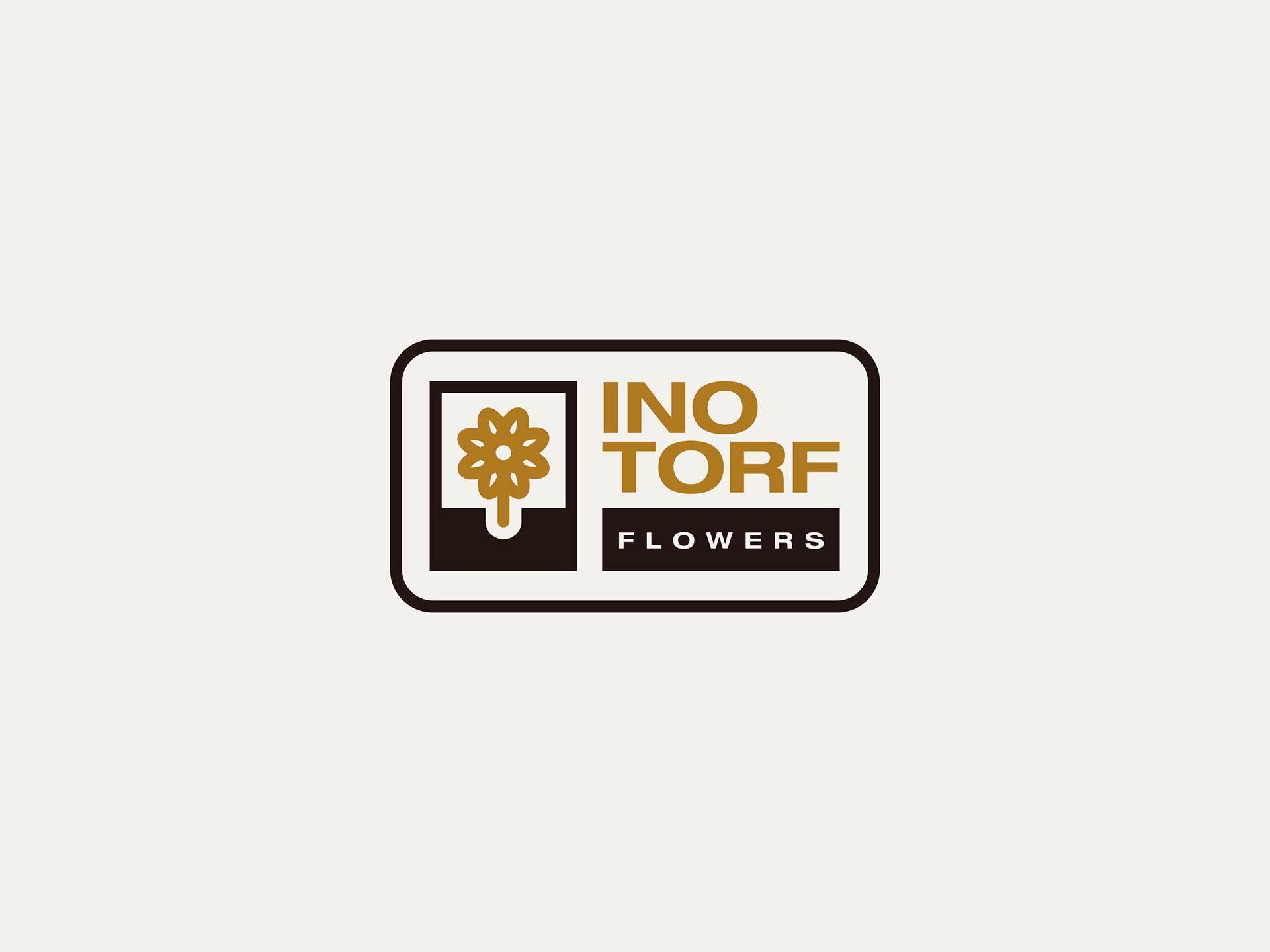
The identity extends by transforming this core element into product-specific icons, allowing the brand to represent different categories while maintaining visual consistency across the entire system.
MAIN LOGO DESIGN
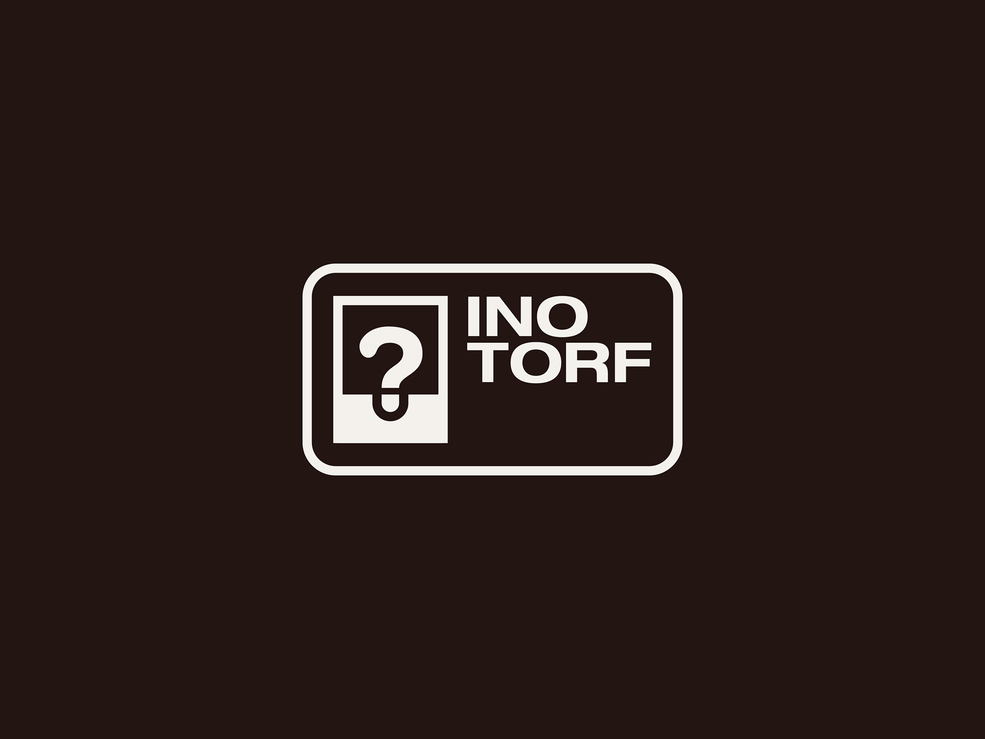
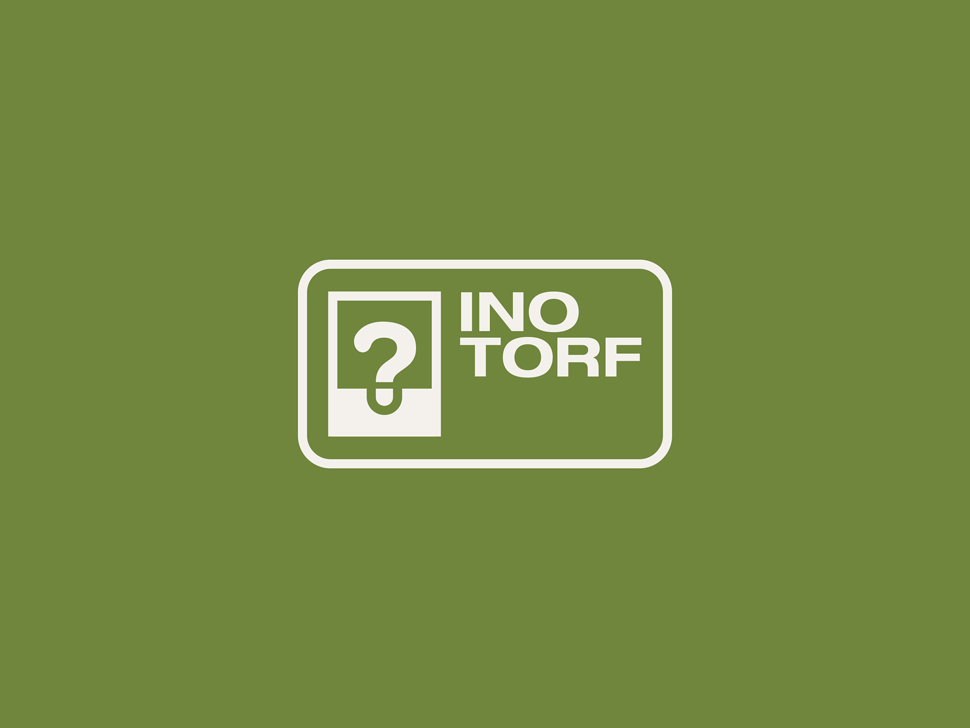
LOGO ADAPTATIONS
˙ ˖ ✦ Thanks for wandering! ✦ ˖ ˙